
Pages
Playlists support adding, editing and changing Pages within Playlists
Playlist Pages
Playlist pages are individual content compositions within playlist sequences. Each page contains one or more content elements (applications, media, websites, objects, interactive buttons) arranged in layouts that display for configured durations before transitioning to subsequent pages.
Page Architecture
Content Composition
Pages function as canvases for multi-element compositions. Content layers stack and position independently:
- Layer system: Z-order stacking with independent positioning per element
- Coordinate system: Pixel or percentage-based positioning
- Sizing controls: Width, height, and rotation for each element
- Alignment tools: Grid snapping and element-to-element alignment
Multi-element compositions enable dashboard layouts, overlaid content, and complex visual designs beyond single-content displays.
Page Properties
Each page includes configuration attributes:
| Property | Purpose | Impact |
|---|---|---|
| Page name | Identification in editor | Organization and management |
| Duration | Display time before transition | Playback timing control |
| Schedule | Time-based visibility | When page displays |
| Campaign association | Ad campaign integration | Campaign-targeted content |
Duration configuration controls page transition timing. Video content can use either fixed durations or duration determined by video length. Fixed durations shorter than video length cut playback short; longer durations loop video. Omitting fixed duration for videos allows natural completion before transition.
Content Types
Pages support five content categories, each with distinct characteristics:
Objects
Geometric shapes and design elements for custom graphics:
Available shapes: Square, Rectangle, Circle, Oval, Triangle, Text, Icon
Styling properties:
- Fill color and opacity (0-1 scale)
- Stroke color, width, and opacity
- Rotation (0-360 degrees)
- Position (X/Y coordinates in pixels or percentages)
- Dimensions (width and height)
Objects create custom graphics, annotations, colored backgrounds, text labels, or decorative elements without requiring external design tools.
Applications
Custom or pre-built TelemetryOS applications embedded in pages:
Integration mechanism: Mount points define application rendering contexts
Configuration: Mount point selection during application placement
Functionality: Interactive features, data displays, dynamic content
Applications bring dynamic functionality to pages: real-time data, interactive controls, custom business logic. See Building Applications for application development.
Media
Images, videos, and documents from media library:
Supported formats: Images (PNG, JPG, GIF), Videos (MP4, WebM), PDFs
Organization: Media folders for categorization
Placement: Positioning, sizing, and layering within page
Media integration supports brand imagery, product photos, instructional videos, or document displays within playlist compositions.
Websites
Live web content or static captures embedded in pages:
Embed modes:
- Live interactive: Functional website with user interaction
- Static capture: Screenshot-style rendering for display-only
Configuration options:
| Option | Purpose | Use Case |
|---|---|---|
| URL | Website address | Source specification |
| Embed mode | Live or static | Interaction requirements |
| Home button | Navigation control | Multi-page sites |
| Zoom level | Magnification | Readability optimization |
| Auto-reload | Refresh interval | Content freshness |
| Authentication | Login credentials | Password-protected sites |
Website embedding integrates web applications, live data dashboards, news sites, or web-based tools into playlist content.
Kiosk Buttons
Interactive buttons for touch-enabled displays:
Target types: Pages, Media, Websites, Overrides
Button styles: Text labels or custom images
Interaction: Touch-triggered navigation to target content
Styling options:
- Text: Font family, size, line height, color
- Button: Fill color, stroke color/width, rounded corners, opacity
- Alignment: Horizontal and vertical positioning
- Accessibility: Alt text for image buttons
Kiosk buttons create interactive menus for self-service kiosks, wayfinding displays, or user-driven navigation.
Layer Management
Stacking Order
Content elements stack in Z-order layers:
- Layer list: Visual representation of stacking order
- Layer selection: Activates element-specific editing
- Reordering: Adjust which elements appear in front
Layer order determines visual hierarchy when elements overlap. Front layers occlude back layers based on opacity and positioning.
Positioning System
Elements position within page boundaries using coordinate system:
Measurement units:
- Pixels: Absolute positioning (e.g., 100px from left edge)
- Percentages: Relative positioning (e.g., 50% centers element)
Alignment assistance:
- Grid snapping: Automatic alignment to grid lines for consistent spacing
- Element snapping: Automatic alignment to other elements for visual harmony
Percentage units enable responsive layouts that adapt to different screen resolutions. Pixel units provide precise control for fixed-resolution displays.
Page Management Operations
Page Creation
New pages start as blank canvases. Content addition occurs through content type selection (Objects, Applications, Media, Websites, Kiosk Buttons) followed by placement and configuration.
Pages can use existing shared content from content library or create page-specific content. Shared content maintains consistency across pages; page-specific content provides unique elements per page.
Page Modification
Existing pages support:
- Content addition: Add new elements to page
- Content editing: Modify properties of existing elements
- Content removal: Delete elements from page
- Property updates: Change page name, duration, schedule, campaign
Page Organization
Move: Transfer pages between playlists for reorganization
Duplicate: Copy pages for reuse across playlists
Delete: Remove pages from playlists
Page copying preserves all content elements, layer order, positioning, and configuration. Duplication accelerates playlist creation by reusing successful page designs.
Multi-Element Compositions
Pages support multiple content elements simultaneously for complex layouts:
Dashboard layouts: Multiple applications showing different metrics
Branded content: Logo objects overlaid on media or websites
Annotated media: Text and shapes highlighting media elements
Navigation menus: Kiosk buttons with background imagery
For advanced multi-region layouts with independent content zones, see Playlist Zones.
Common Use Cases
Single-content pages: Full-screen media, applications, or websites
Dashboard pages: Multiple applications displaying related metrics or data
Branded pages: Media content with logo objects and text overlays
Interactive kiosks: Kiosk buttons with background imagery for touch navigation
Annotated displays: Media with text objects explaining content
Web integrations: Embedded web applications with branding objects
Multi-media compositions: Combined images, videos, and applications in layouts
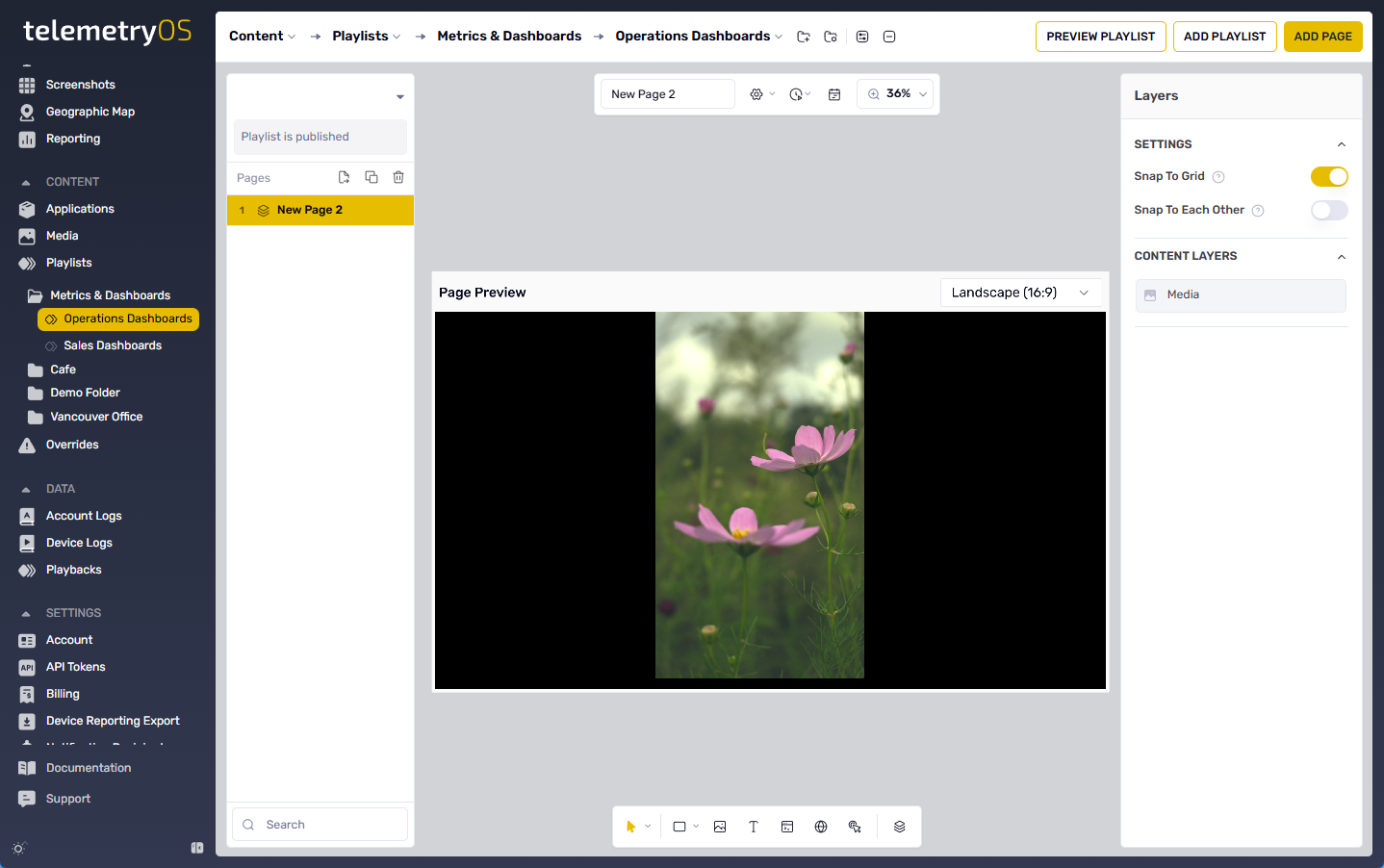
Page Editor Interface
Pages are created and configured through the Playlist Editor (Content > Playlists > Edit Playlist). The editor consolidates content type options (Objects, Applications, Media, Websites, Kiosk Buttons) in unified interface.
Visual preview: Real-time page preview during composition
Content library: Access to applications, media, and shared content
Property panels: Context-specific configuration for selected elements
Layer management: Stacking order and element organization
Understanding Objects, Applications, and Media content types enables effective page composition. Each content type serves distinct purposes in playlist designs.
Configuration Specifications
Page-Level Settings
- Page name (optional, for organization)
- Display duration (optional for auto-advance content like videos)
- Schedule (optional, time-based visibility)
- Campaign association (optional, ad campaign integration)
Element-Level Settings
Vary by content type:
- Objects: Position, size, colors, opacity, rotation
- Applications: Mount point, position, size
- Media: Position, size, layering
- Websites: URL, embed mode, zoom, reload, authentication
- Kiosk Buttons: Target, style, colors, fonts, position
Limitations
- Page complexity impacts rendering performance (recommend < 20 elements per page)
- Element overlap and transparency affect rendering performance
- Very precise positioning may require pixel units rather than percentages
- Layer order matters for overlapping elements with partial opacity
- Website embedding requires public URLs or authentication credentials
- Interactive features (kiosk buttons, live websites) require compatible devices